Tampilkan postingan dengan label lines. Tampilkan semua postingan

Sabtu, 07 Mei 2016

Support and resistance as horizontal lines ~ forex trading times uk


 The basic technical measurement of horizontal support and resistance provides the ground floor of technical analysis. Whenever you look at a currency pair, you have to ask where support is and where resistance is. The answers provide the first mapping of the market.
Support is where the price stops falling, and resistance is where it stops rising. The process for locating support and resistance is fairly straight forward. In picture 1 includes several support and resistance lines. Those lines that form floors and ceilings are outer support and resistance containing the price action within a range. Those lines that are inside these larger lines are inner support and resistance.
What is most significant about horizontal support and resistance lines is that they are not lagging. In contrast to indicators, they are projections and form psychological hurdle ones. When price establishes support or resistance, the market recognizes that location as a zone or hurdle that has to be overcome. The immediate future price movements need to probe and penetrate a support or resistance line. One of the first principles of trading forex is to locate a trade near support or resistance.
Once we know where horizontal support and resistance are, we need to also determine the strength of that support and resistance. There are different ways of forming an opinion about the level of strength in the S/R lines- In Picture.1, we can see that the 1.1649 level offers strong support because over 18 months that price point was unable to be broken down and the euro–U.S. dollar (EURUSD) held above it. In contrast, the resistance levels show only one test of the previous high. The trader can conclude that there is greater strength on the support side at 1.1649. If the price moved toward the previous high (1.3689 on 2004/12/01) and failed to go through it, confidence that resistance was stronger at that level would increase. The time interval on a chart also can be used to weight one’s confidence about how strong the S/R levels are. The longer time frames such as monthly and weekly resistance and support are more robust. After all, a great deal of money has had the chance to go through those levels but did not.
In constructing support and resistance lines, the trader needs to realize that there is a degree of judgment. In picture 1, the support and resistance lines are drawn where there appears to be a set of highs and lows. Some of the candlewicks are penetrating the lines. Those penetrations would be viewed as creating temporary levels of new support and resistance, with the stronger levels being those connecting more points. Drawing support and resistance lines need to be done with the perspective that these are zones and not exact lines.

In picture 1, the breakout of the level of 1:3689 has produced a bullish movement important.
Support and resistance as horizontal lines


Support and resistance as horizontal lines
In picture 2 USD / JPY (above)Horizontal levels based on support and resistance monthly. Note how the breaking of a level causes a reaction of the price.


Support and resistance as horizontal lines quiz

1. What is Support line?
  • Support is where the price stops falling
  • Vertical line
  • Trend line down that touches imaginary points
2. What is the Resistance line?
  • A diagonal line
  • Trend line up that touches imaginary points
  • Resistance is where it stops rising
3. What he needs a projection of the price?
  • Draw a trend line
  • The last five Bid and Ask
  • Penetrate a support or resistance line
Score =

Correct answers:

More info for Support and resistance as horizontal lines ~ forex trading times uk:
Read More..

RSI Stochastic with Bollinger Bands ~ forex market hours gmt.mq4


The two indicators I will be using are Bollinger Bands and stochastic relative strength index (StochR SI ). StochRSI , which combines the features of stochastics and RSI , was
detailed in Tushar S. Chande and Stanley Kroll’s book, The New Technical Trader. I selected this combination because it is a useful way to determine when prices will stop tagging a Bollinger Band and are likely to move all the way from one band to the next. Of course, those prices may not move all the way, so you will need to use stops for protection. You will also want to use a simple money management strategy of allocating only a portion of your capital to any one position.
First, let’s take a look at R SI and StochRSI . Stochastics, you will recall, is simply a way of measuring, for a given period of time, where today’s close is relative to the lowest low, and where within the range of the highest high and lowest low the price falls over the same time period. The formula for stochastics for a 14-day period is:
Todaysclose– Lowestlowofthelast14 days/
Highesthighofthelast14 days– Lowestlowofthelast14 days

Note the use of range — high minus low — in the denominator of the calculation.
Many trading techniques and strategies are built around range in some form, and if you use several indicators, you want independent sources, so that the indicators independently confirm one another.
Independent confirmation is one part of Dow theory you should consider embracing. For example, Larry Williams’ %R is the reverse of stochastics, substituting the difference of highest high
over a given period minus today’s close for the numerator. So if you want to use this indicator together with stochastics, you are not using independent indicators.
Instead, you should consider using an indicator that does not involve a range, such as volume, or one that is statistical in nature, such as Bollinger Bands.
The next step is to identify the type of stock that will work best. If you are going to use an indicator that relies on price volatility such as StochR SI , then you should examine your charts to see the
nature of the current volatility. For example, I have used AOL Time Warner (AOL ) in Figure 1. What differentiates the four areas (A, B, C, and D) is the combination of price and volume
volatility. Area A has low price and high volume volatility. Area B has both high price and volume volatility. Area C has high price volatility, and low volume volatility for the stock.
Finally, area D has moderate volume and price volatility. A useful rule to remember is that a price is “in gear” — that is, in sync — if price goes up on high volume or down on lowered volume. Prices that reflect such moves are prices that the market is comfortable with. If you were long in area A or

short in area D, you would have done well. A trading system designed for areas A and D — “ingear” moves — is likely to have a terrible time in areas B and C. As you will discover shortly, AOL represents the good, the bad, the ugly, and the really ugly when it comes to using a trading system that only takes long positions.
Stochastic RSI Trading System
IGURE 1: DAILY AO L PRICE AND VO LUME. Price volatility is less before June 1998. For indicators that use price volatility such as StochRSI, you want to use fewer periods in the calculation to generate trading signals than you would prior to June 1998.
Stochastic RSI VS RSI
RSI VS . STOCH RSI If you compare RSI and StochRSI measurements over a few months, you
will notice a difference: One of them will hit the extreme faster and tend to stay near the extreme better than the other. The formula for StochRSI for a 14-day period is:
RSI– LowestRSIoverthelast14 days/
HighestRSIoverthelast14 days– LowestRSIoverthelast14 days

If you build this indicator, of course, you can make the RSI use a 14-day period or you can, for example, make the RSI based on a nine day period and retain the 14 days for the stochastics portion. As you can see from Figure 2, StochRSI does a better job of hitting its extreme and staying there than R SI does. StochR SI allows you to draw a line that acts as a threshold line better than RSI (black lines drawn within green boxes). While bothRSI and StochRSI range between zero and one — although cosmetic adjustments are made to RSI so it appears to range between zero and 100 — StochRSI hits its extreme faster because you are only looking at the RSI over a recent lookback period. Still, there are times, as in April, when StochRSI gives you a mixed message.
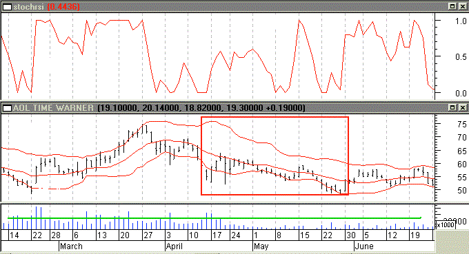
This is where Bollinger Bands can help. If you overlay price with Bollinger Bands, as in Figure 3, you begin to get an idea of the setup for a long position:
Act when prices are tagging the lower band (point A) with a move up (point B), while StochRSI shows a significant gain in value (point C). However, this setup has potential problems for long trades; look at the red box in the chart. In April and May 2000, you have examples of prices tagging the lower band and then closing above. In one instance (event D), StochR SI would potentially give a confirming signal that you should go long, but then prices go back down to the lower band. This is an example of the problem I referred to earlier, that low volume is often
Stochastic RSI VS RSI
FIGURE 2: DAILY AO L PRICE AND VO LUME 2000 WITH RSI (TOP CHART) AND STOCHRSI (SECOND FROM TOP CHART). StochRSI not only responds quickly to price changes, but also hits its extreme and stays there better than RSI (see green boxes); 14-day periods are used for both RSI and StochRSI.


accompanied by randomness. Note that volume in late April and May is significantly lower than in the preceding time frame. I will try to incorporate some rules into the trading system to account for this, but in such a situation it is often best to exit and find another stock.
I will now execute a trading system, without stops and money management, to see what it can do. The trading system is going to have the following trading rules for a long position:
Stochastic RSI Trading
FIGURE 3: DAILY AOL AND VOLUME AND STOCHRSI (UPPER CHART): FEBRUARY/JUNE 2000. A 20-day, two standard deviation Bollinger Band is overlaid on the price chart. On the left hand side is a setup that promises to enter a long position. It starts with prices tagging the lower band, event A. Prices close above the lower band, event B, and at the same time StochRSI has moved up to a value of 0.4, event C. What is distressing is the action in the red box, especially in view of event D, a spike in StochRSI and a close above the lower band followed by a retreat of prices. But if you look at volume below, the problem mentioned earlier is obviously apparent: low volume giving you a random price movement.
Entry:
1 Look for prices tagging the lower Bollinger Band
2 Look for a closing price of an up day, that is (close>open), that is above the lower band after having prices follow (1)
3 Volume of this up day should be greater than the volume of the previous up day
4 StochR SI should be above a threshold to ensure some momentum is associated with the push up
5 The (close-open)/(high-low)>0.2, to avoid days that have short candlestick bodies.
Exit:
1 StochR SI should be less than a threshold to assure loss of momentum
2 Look for prices to reach the upper band
3 Closing price should be near the top Bollinger Band.

You are looking for the stock to continue up if it has been tagging a lower Bollinger Band and then made a convincing move up, so that it conforms to entry rules 2 through 5 above. I used weighted closes in calculating the Bollinger Bands:
(2*close+high+low)/4.
From Figure 4 you can see that investing $1,000 in 1997 and using this trading system without stops resulted in $58,000 (second chart from top), which beat buy/ hold by more than $47,000. However, there are serious drawdowns in each of the areas B, C, and D. The only factor that varied in this trading system was the number of periods for StochRSI and Bollinger Bands. When using the initial version of this system I optimized the StochR SI thresholds as well. The equity looked better in terms of drawdowns and ended up with $300,000+, which led me to believe that there might be something to this approach.
Optimizing on everything — from periods to thresholds — results in spectacular equity performance (Figure 5), and although it is curve-fitting, it shows the potential you are trying to
achieve. It also shows the trading system is biased to take advantage of strong
uptrends: During uptrends, prices that tag the bottom Bollinger Band will
FIGURE 4: DAILY AOL AND VOLUME WITH EQUITY PERFORMANCE. Starting with $1,000, a trading system that goes long using Bollinger Bands and StochRSI is seen to have four trading behaviors, as indicated by areas A, B, C, and D. Note the equity scales are X10. The second chart from the top is the equity performance without stops. In area
A, the system makes little money despite rising prices, breaks even in B, has a better performance in C, and then performs poorly during D. Even area C is not especially appealing because you are faced with serious drawdowns, unless you use stops (as seen in top chart). The top chart, using maximum stop-losses of 5%, provides better performance.
move to the upper band, resulting in a trading system that can do much better than buy and hold. But letting thresholds optimize curve-fits the performance too much, so I set the thresholds visually. To get rid of the serious drawdowns, I used maximum loss stops of 5%, which improved the equity performance (Figure 4: top chart). Still, area B just eats away at your equity, although it does appear I took care of the low volume problem in area C.
FIGURE 5: DAILY AOL AND VOLUME WITH EQUITY PERFO RMANCE FOR AREA A. A $1,000 equity investment reaches $45,000+, while buy and hold reaches $20,000+. While this kind of equity performance (top chart) is spectacular, it comes from letting all the variables in the trading system be optimized — curve-fitting. What this shows, however, is the potential of the system if the periods and thresholds are chosen correctly, along with the right (strong uptrend) price movement. It also reflects the bias of the trading system, which takes advantage of the fact that in a strong uptrend, prices that tag the lower Bollinger Band do so only briefly.
Reference :
Stocks and Commodities Developping a Trading System by Dennis Peterson.


More info for RSI Stochastic with Bollinger Bands ~ forex market hours gmt.mq4:
Read More..

Rabu, 04 Mei 2016

EMAs 5 13 62 Trading ~ forex market hours gmt metatrader 4 indicator


Exponential Moving Averages (described in more detail below) are at the core of tis strategy. From the beginning you should understand that I didn’t invent the 5/13/62 strategy. At least I don’t think I did. There are some extras that I add in, but essentially, all of this information is available elsewhere. That said, I believe that most of the people that write about forex have a way of putting you and I to sleep. So maybe this is the first time you’ve heard about it, but in any event, I’ll try to
keep it interesting.

Here’s where we start. With a chart:
EMAs 5, 13, 62, Trading
If the chart above doesn’t make any sense to you, even with the legend, then here’s a brief explanation:
1. The candles are easy to read. Green ones are ones that closed lower. White ones closed higher.
2. The EMA lines are crossing at the left. The 5 (red) crosses below the 13 (the yellow) and both the 5 and 13 are crossing the 62 (the blue one).
3. You can see that in this chart, the British Pound fell about 110 pips in less than a day. That’s the chart. What can we learn immediately?
1. When the 5 crosses below the 13, and both of them cross below the 62, it’s possibly a good sell signal.
2. Inversely, we can assume that the opposite is true: when the 5 crosses above the 13, and both cross above the 62, it’s a buy signal.
What is the EMA?
Moving averages are the average value of the price of a currency pair, over a certain period of time. A 5-day moving average for the EUR/USD would be the average price of the EUR/USD over a 5 day period. You can base the average on the closing, opening, or other price. Each time the MA is calculated, the earliest period is dropped and the latest period is added. In this way, the average price fluctuates according to the fixed time period.
The exponential moving average (EMA) puts the emphasis on the most recent prices, and less emphasis on the older prices. Sometimes you won’t see much difference between the EMA and the Simple Moving Average, which does not weigh any price more than another.

Is that it? Do I just look for the crosses?
I have backtested (and so have many, many others) simply buying when the signals cross above and selling when the signals cross below.
There are even companies that build trading robots that will automatically buy and sell when these signals are given. But, as much as I’d like to say differently, it’s not that easy.
There are all types of false signals (crosses that happen but that don’t turn profitable).
Here are some other principles of this strategy, divided in three sections: entering the trade, staying in the trade, exiting the trade. The principles of each section will help you maximize your gains and
minimize your losses. But first, a quick look at the tools you’ll need.

The 30 minute chart
I have used the 15 minute, 30 minute, 1hr, 4hr, daily … even the weekly chart. You can really use anything longer than 15 minutes. I recommend starting with the 15 minute or the 30 minute, so you will see more opportunities in a shorter period of time.
The 5 and the 13 alone Chart the 5, the 13, and the 62 period Exponential Moving Averages.

Making the Trade
Below you’ll find the principles behind making good trades. And avoiding the bad ones. These are guidelines. Good trades based on these guidelines are the result of applying them enough times that you begin to get a feel for the market. I want to emphasize that you can change these rules. You can
manipulate them. You will be most successful when you make this “your own,” by adjusting so that you feel most comfortable.
Holidays and other bad days
Try not to trade on holidays, especially U.S. holidays. It’s best to stay out of the market on those days and catch up on time with your family, see a movie, adjust the metal rod that was placed in your back, insert a metal rod in your back, or fire up the barbie-q and roast some weenies. Or you can back test your strategies. It’s also best to never, ever, ever, enter a trade past 14:00 GMT on a Friday. On holidays and late on Fridays, the market is unpredictable and might not move enough to give you any profit. Or it might move 50 points in one direction just for the heck of it, and then move back. Of course it might move a zillion pips, but that’s the exception rather than the rule. Then you’re stuck in what might become a losing position, but meanwhile, you’re losing money to premiums/interest paid to your broker. This is a good time to shove a metal rod into your spine.
Please take my advice and just stay out of the market, with this system, at these times. You may lose some opportunities, but you will lose (also) the chance of getting trapped in a motionless or unpredictable market.
Other systems, long term systems in particular, can work okay late on Fridays and on holidays. But that is the subject of another ebook.
One, incidentally, that I have not written yet. Trading on the 5 and the 13 You should be prepared to buy anytime the 5 crosses above the 13.
You should also be prepared to sell anytime the 5 crosses below the 13. You should be prepared to do this even if they do not simultaneously cross the 62. This does not mean that you take the trade immediately. It means that you are aware that a trade might be coming.

Is the currency pair in a DNA Spiral?
Often, a currency pair will find itself in the middle of what I call a DNA Spiral. It’s when the pair doesn’t know what to do – it just sits in a very, very tight range, like this:
EMAs 5, 13, 62, Trading

As you can see, the red (5) is crossing above and below the 13 (yellow), but the signal is false – you wouldn’t make any money on these trades because, as soon as the cross occurs, it corrects itself in the opposite direction. It’s obviously best to stay out of the market on these occasions. So, if you walk up to your PC and see these DNA Spirals, make trades cautiously. If you enter the trade, then stay close to the computer and prepare to get out if the market really swings the other way.

Is the 13 crossing the 62?
The next part of the system is to watch for the 13 to cross the 62. Whether above or below (long or short positions), you’re in good territory. At these times, it might be a very, very good opportunity.
An example of what the chart looks like when this happens is pictured on the next page.
As you can see in the pink box in the chart below, the 5 (red) is crossing below the 13 (yellow) at the same time the 13 is crossing below the 62 (blue). This can be very powerful. I want you to also focus on the fact that the pair, after this crossover occurs at the pink circle, return to hit the 62 EMA again – and this is an excellent time to sell the pair all over again. This means that if you miss the original trade, it’s totally acceptable to enter the trade when the pair rises up and hits the 62.
You can see an example of this in the blue box on the chart below. This works for long and short trades – the 62 EMA will act as a dynamic level of support and resistance.
Stops and limits
Last of all, do the following:
1. Set a stop-loss at 20 pips beyond the 62 EMA.
2. Trail the trade by 20 pips (using a trailing stop loss), or:
3. Set a profit target at a recent high or low (something that creates a double top or double bottom).

During the Trade
Lots can happen during the trade. Here are some things to consider and remember during the trade.
Set it and forget it?
believe that anyone that tells you to “Set it and forget it” is appealing to your desire for quick, easy profits without any work. Right now, I would like to appeal to your desire for quick and easy profits without any work. I will do this by telling you that if you choose a recent high/low as your profit target, or a trailing stop, then you can walk away. Walking away gives you time to spend with your family, work on your computer, take out the trash, wash the dog, or start a rock band named “The PipMeisters,” with me playing the drums and this guy with really long hair at lead vocals, who smokes so his voice can be really raspy, but has family problems and sometimes has to spend the night in jail, which eventually breaks up the band and leaves us 10 years later looking a photos and saying, “Those were the days when we could rock soooo hard.” If this disappoints you, or if you don’t know if a rock band is right for you, then feel free to watch the trade while it’s open.
That’s ok too. Although many traders have experienced problems with peeing in their pants while trades are open. Of course that’s not a problem for you. Or me. Definitely not me.
Initial volatility
At the beginning of the trade, you might see some initial volatility. This means that after the candle closes, you might see the next candle go opposite from where you want it to be. Don’t get overly concerned about this. You need at least 20 pips of free room to let the trade gather momentum. And remember what I said (not about the rock band): the pair might rise up or fall down and hit the 62 EMA. This is just another opportunity to get in the trade if you did not already (or add to your position).
Exiting the Trade
We already covered this, because you set the limit at a recent high or low, or you set a 20 pip trailing stop. Let the system exit the trade for you, based on your stops and limits. Most forex dealers will guarantee stops and limits, so you’ve got little to worry about.


More info for EMAs 5 13 62 Trading ~ forex market hours gmt metatrader 4 indicator:
Read More..

Minggu, 27 Maret 2016

Slow Turtle System ~ forex trading sessions gmt


Turtle trading system originally developed by Richard Dennis and William Eckhardt and now being used by possibly hundreds of hedge funds to manage currencies, stocks, and commodities.
They made a bet and then used very minimal criteria to select a group of students to teach.
These students became the original “turtles” (named after the Turtle system that they were taught) and most of them went on to manage fairly impres- sive funds. All of them were sworn to secrecy about the details of the original system. However, I doubt at this point any of them use that original
system and if they do, it is certainly not the version we want to be using, the Turtles trade trends.
Basically, if a commodity or stock is breaking to new highs, the idea is that that momentum should continue and you should just ride the asset until it is no longer making new highs. By trading a basket of uncorrelated markets, you can take advantage of the fact that at any given point, some where in the financial universe, something is in a bull market.
Trend-following can offer huge returns. If you catch close to the beginning of a huge bull move in a market, the returns on that trade can be multiples of 100 percent. Similarly, the drawdowns can be enormous. Dennis himself has gone in and out of the hedge fund business several times, most recently closing shop in 2000, primarily because his drawdowns have been immense and clients have withdrawn money. The key to success in a trend-following system is not in picking the right entries and exits, but merely staying in the game to be able to withstand the drawdowns. That said, if one chooses a basket of assets carefully so that they are as uncorrelated as possible, it may be possible to smooth out drawdowns. We will see a simple example of that possibility in a bit.
The version presented here is based onone told to me by a manager of a multibillion-dollar trend-following fund. Al-though most of the systems presented in this book are short-term countertrend systems, I do think a properly diversified trading strategy should
include some trend-following component. This is the system I currently use:
Buy if an asset’s 22-week closing simple moving average crosses over its 55-week closing moving average; buy at the market open the next
Monday.
Sell if an asset’s 22-week closing simple moving average crosses under its 55-week closing moving average; sell at the market open the next Monday.
Note the simplicity of the method. The more complicated a system is, the more likely it is to suffer from severe curve fitting. Basically, I am not as interested in using complicated methods from quantum mechanics to identify trends. If an asset is moving up so that its slow- and fast-moving av-
erages are moving up, then I am happy to say it is trending.
Why no shorting? As we have seen in Technique 5, shorting is not necessarily the opposite of going long. Along with the fact that the markets have a natural bias to move upward over the past one hundred years, your upside is also capped at a 100 percent. When following a long-term trend following system, it is possible to have trades that make well over 100 percent. Also, if you choose your basket of assets correctly, you can be going long some assets, while other assets are on their downtrends.
EXAMPLES
S&P 500, June 1958 to June 1961
The lowest line in Figure 1 represents the 55-week moving average. The line directly above it represents the 22-week exponential moving average.

On June 23, 1958, the lines crossed, and we bought at the open of the next week holding until the bottom line crossed under on May 2, 1960, when we closed out the trade for a 19.6 percent profit. The market seesawed for a year or so afterwards before we bought again on January 3, 1961, at the start of the next bull market that lasted throughout the 1960s.
Slow Turtle System
Slow Turtle System
S&P 500, July 1987 to May, 2003
Of course, no trend-following system would be worth its weight in salt if it did not capture the trend that occurred throughout the 1990s as shown in Figure 7.2. As seen in the figure, the system was long the market from February 19, 1991, right after the Gulf War, until December 11, 2000, for a 271 percent return. (Also see Table 7.1, Table 7.2 , and Table 7.3 .
You can, of course, run this system on stocks. Table 7.3 shows the results of the system on Nasdaq 100 stocks, starting with $1M and using 2 percent of equity per trade. The system was almost always in the market and had, of course, its equity peak at the peak of the bull market in 2000 (see Figure 3, ).
Figure 4 shows the annual returns of the system.
Using the Turtle system on stocks, you would have been able to maximize the advantages of the bull market while keeping drawdowns some what low in the bear market even though they existed. Notably, despite being a horrible year for the broader market, 2001 was up 8 percent in this
system. The annual returns are shown in Table 4.
Results for Turtle System on the S$P 500
  
S&P 500 Weekly chart Turtle System
  
Trades for slow Turtle on S&P 500
Looking at Figure 5 , an analysis of the maximum adverse excursion (the amount a trade went negative before closing out), the light gray trades represent the trades that eventually were closed out as profitable trades but underwent a drawdown in the process. One trade was as much as 40 percent down before returning to profitability, and 17 trades were between 20 percent and 40 percent down before returning to prof- itability. We can see in the results that the maximum drawdown from peak to low was slightly over 58 percent. Nevertheless, this system greatly out performed the market from 1998 to 2003 and was able to benefit massively during extreme bull market moves. Again, having a trend-following system in your arsenal is an important weapon in addition to the various countertrend systems we have demonstrated in this book.
Simulation of Slow Turtle on the Nasdaq 100


Figure 4 Slow Turtle
Figure 4 Slow Turtle 

Figure 5 Slow Turtle Winning Trades


More info for Slow Turtle System ~ forex trading sessions gmt:
Read More..

Kamis, 17 Maret 2016

Bollinger Bands System ~ forex market hours gmt mt4 indicator


The basic idea for using Bollinger bands is that when a stock hits the upper band, it is usually overbought so you should short, and when a stock hits the lower band, it is usually oversold, so you should buy. The rationale is that price tends to revert to its moving average.
Buy when a stock hits the lower band using a 20-day moving average
and 2 standard deviations.

Sell when a stock returns to its moving average.
Bollinger Bands System
figure 1 Bollinger Bands System
On July 7, 2001, CHKP (shown in Figure 2) gapped down and proceeded to hit its lower Bollinger Band at 40.45. The system held the position until July 27 at 42.69 for a 5.51 percent profit. (See Table 1 for results.)
Bollinger Bands System results
The basic idea holds up and delivers a fairly consistent return with a high probability. There are several twists that I do on the basic system to improve both the odds of success and the percent return per trade. For one thing, I do not like to wait for the stock to return to its moving average.
Even if a company is in big trouble, even going bankrupt (and see Technique 3 on bankruptcies for an example of what I am about to say), stocks do not move in a straight line. The faster the spike down, the more likely the stock is to do a quick bounce up. However, if the company is truly in trouble, over time the stock will do its little spike up and then drift down, bringing the moving average, and the potential for profit, down with it.

Not only am I interested in if the stock simply touches the Bollinger band, but if it decisively breaks through it, which introduces the concept of “per- cent b.” Percent b (%b) is the percent level the stock price is at relative to its bands. If the stock is dead center between the bands, then the %b = 50.
Bollinger Bands System
If the stock is touching the upper band, then the %b is 100, and if it is below the lower band, then the %b is negative. The following formula is used to calculate %b:
Formula Bollinger Bands %
Which all leads to the following:
Buy when %b is less than –20 using Bollinger Bands on the 10-day moving average with 1.5 standard deviations and hold at least until the close of that day even if profit target is hit.
Sell when either a 15 percent profit target is hit or four days go by, whichever comes first. With this system, we are using the 10-day moving average to get quicker and sharper spikes. We use a –20 %b to make sure it is a decisive break of the bands. And if we don’t get our target within four days, then we are run like hell out of the trade.
Example: SEBL, 8/31/98
August 31, 1998. The markets had been in turmoil all summer, culminating in the Long Term Capital Crisis. Panic had set in and everyone was worried the party was over. After nine down days in a row, during four of which the lower Bollinger Band was broken through, the stock price finally hit our buy target at 4.81 on August 31. The next day it bounced, hitting a 15 percent target at 5.54 (see Figure 3).
Example: BRCD,4/14/2000 April 14, 2000, was not a pleasant day to be long tech stocks. In fact, it seemed like the world might quite possibly end. At the time I was working at 44 Wall Street, and when I left the building that evening pedestrians were jokingly being warned to stay away from the sidewalks just in case people were jumping out of buildings. Nevertheless, despite the pain, it was certainly an important day to be buying short-term moves in stocks. As shown in Figure 4, on that day, BRCD triggered a buy signal at 46.42. It started to make a comeback on Monday the 17th and finally hit the 15 percent profit target on the 18th at 53.38. (See results in Table2.)
Bollinger Bands system
Figure 3 Bollinger Bands system


More info for Bollinger Bands System ~ forex market hours gmt mt4 indicator:
Read More..